What Should You Test?
4 landing page elements you need to A/B test
High-converting landing pages don’t happen by accident. They’re the result of plenty of brainstorming, research, and most importantly, testing.
Even the best marketers don’t know for certain what copy and images will work best. Sure, they have a good idea, but you’d be surprised how often they’re wrong.
That’s why A/B testing (also known as split testing) is so crucial. It gives you the opportunity to test different variations to see what really works. That way you’re never guessing.
But what parts of your landing page should you test? Here are four elements you should definitely perform an A/B test on.
Note: Make sure to only test one element at a time. Otherwise, you won’t know what’s actually causing your conversion rate to move up or down.
Headline
We’ll start with the most obvious one. Your headline is the first piece of copy visitors read, and plays a huge role in whether someone will stay on your page or click away.
So, you need to get your headline right.
Sometimes a short headline is best. Other times a longer headline works well. You’ll see headlines that focus on the primary benefit, ones that highlight something the reader is struggling with, and others that ask a question.
Create as many headlines as you can think of and then choose your top two or three to test.

Images
Just as important as your copy is your images. Especially your hero image, which appears at the top of the page and is often the first thing visitors will notice.
Here are a few things you’ll want to test when it comes to images:
- Different types or styles: is your audience drawn to illustrative or photo-realistic images?
- Placement: try using image placement to draw attention to key messages on your page
- Number of images: sometimes less is more, and sometimes an image can play a pertinent role in communicating your message
Keep experimenting with your imagery until you find something that resonates with your audience.
Page length
The general consensus is that a simple inexpensive offer needs less copy and an expensive offer that’s more complicated requires more copy.
But that’s not always the case. Sometimes visitors want you to get right to the point, and other times they need more information.
That’s why it’s a good idea to create a short and long version of your landing page and test them against each other. You might be surprised which one wins.
CTA Buttons
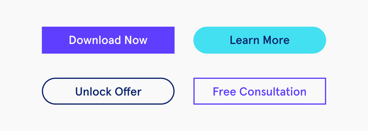
Your call to action (CTA) buttons are where your conversions are made. So, you’ll want to test a few different options to see if there’s any difference in the conversion rate.
First and foremost, come up with a few CTAs to try. Keep them short, simple, and direct. Make sure they tell the reader exactly what you want them to do.
Next work on the button itself. That includes:
- Size
- Placement
- Number of buttons
- Color
Keep experimenting
The best marketers are never satisfied. Even if you think your page is performing well, keep A/B testing. You never know when you’ll stumble upon a variation that works even better.
